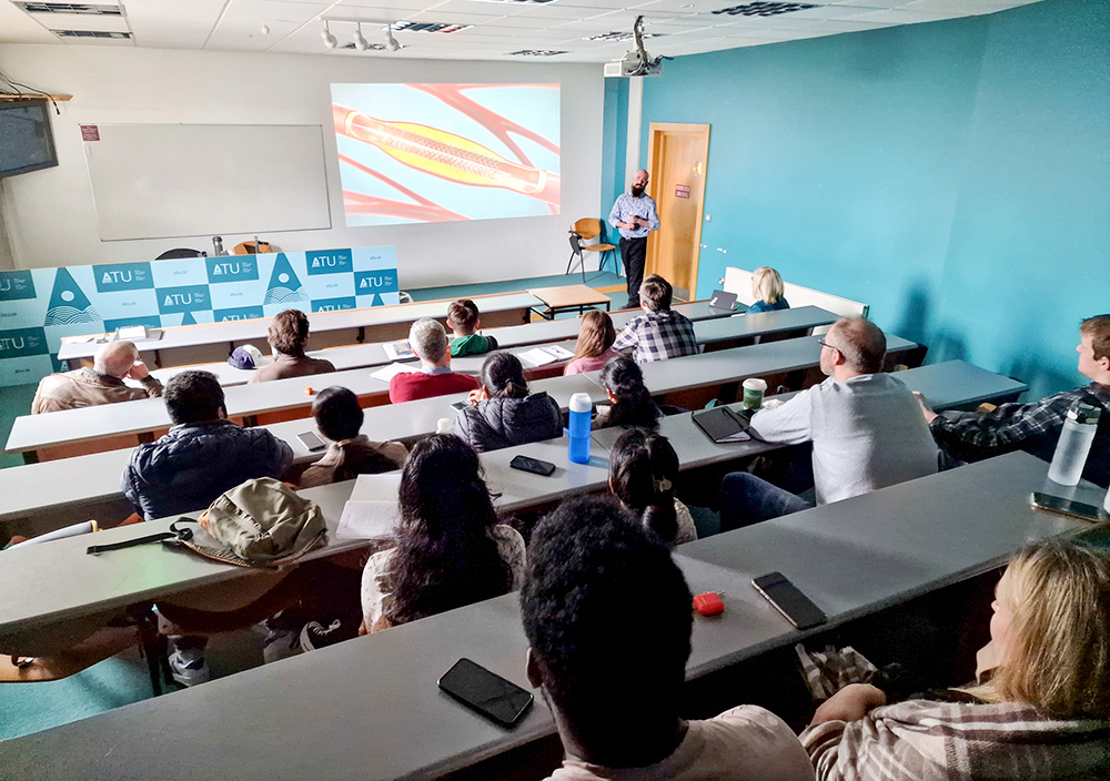
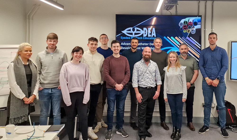
Eyedea is a successful new business based in the west of Ireland that operates in the niche space of in-person catheter manufacturing workshops.
The founder, Damien, had found a successful niche to build his business in, but struggled to expand upwards into larger clientele that could offer more reliable business. There were a few reasons for this:
To understand the client’s current value proposition, I mapped out a detailed walkthrough of his current website experience.
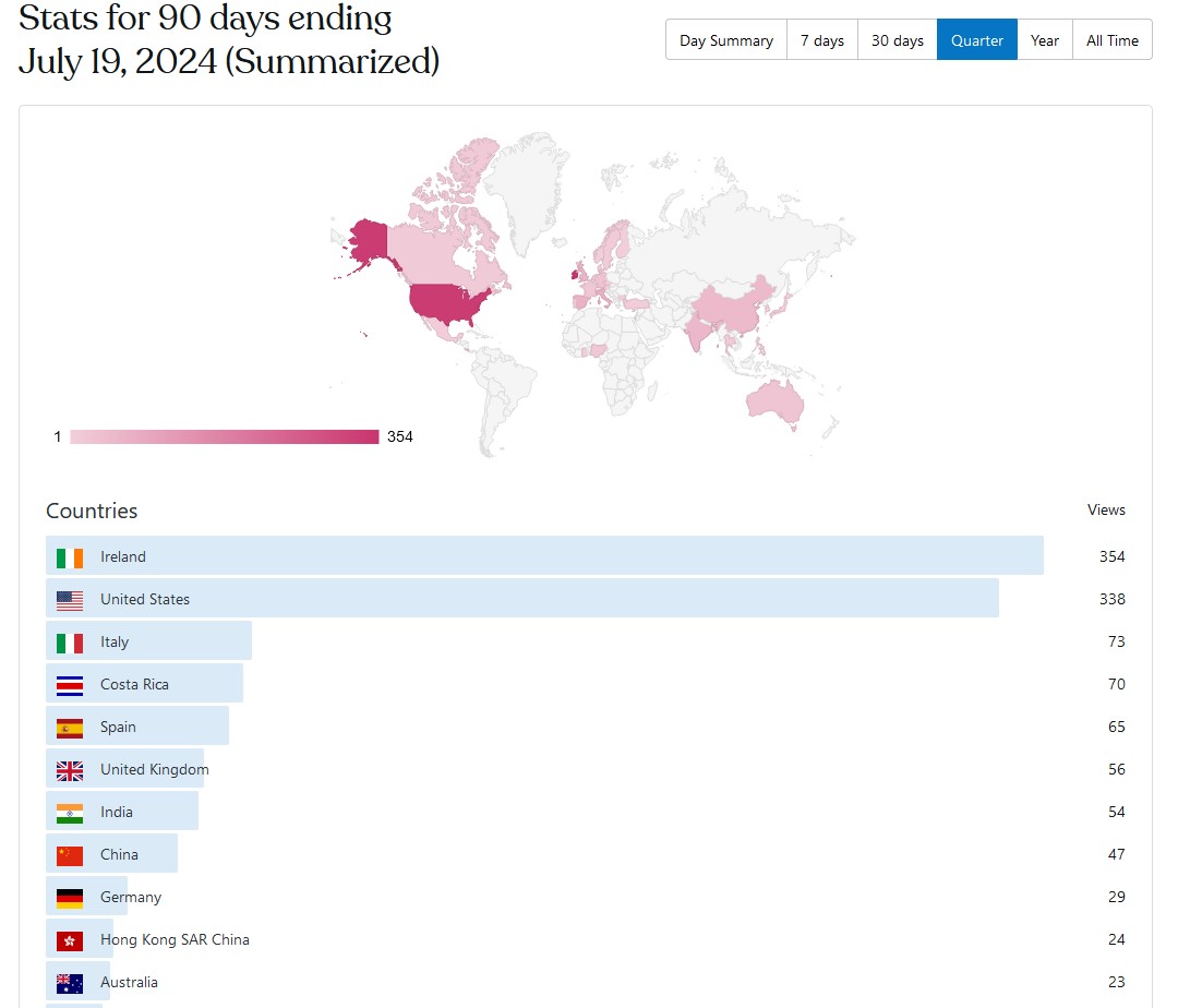
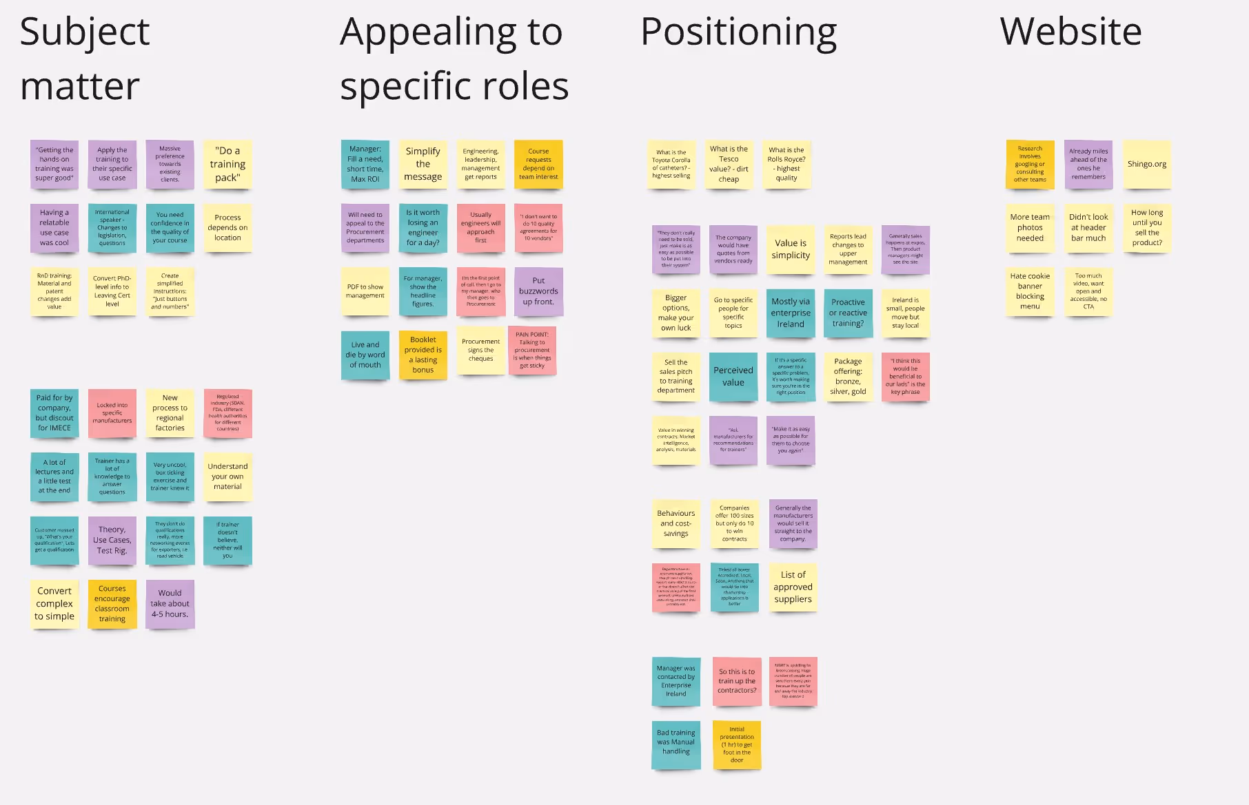
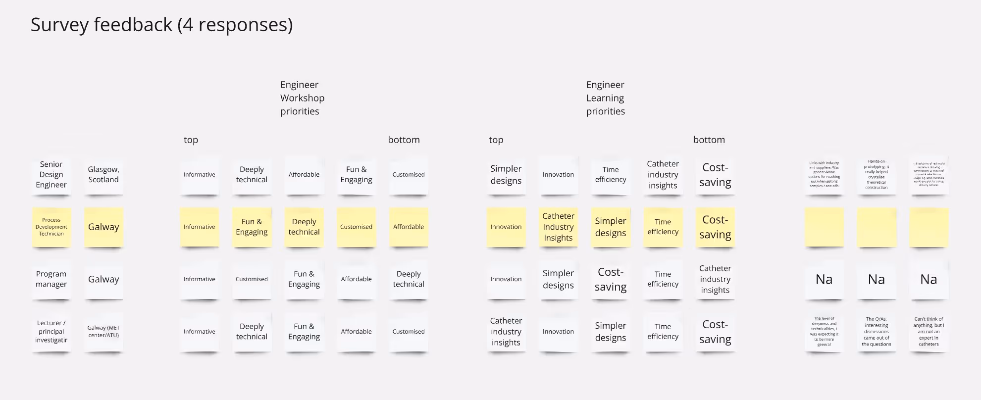
To find more data-driven findings built a survey for him to offer to students post-workshop, looked into how he differed from his primary competitors, as well as his web analytics.
Finally, I contacted as many contacts and co-workers in various engineering roles as I could to reconnect and chat with them on their experience when training.
Qualitative:
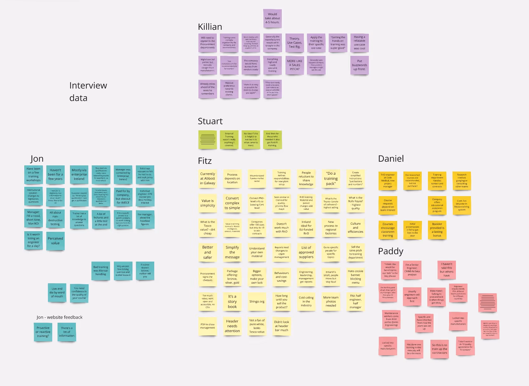
Interviews with past participants (3)
Interviews with engineers in other disciplines (6)
Competitor analysis (4)
Website heuristic walkthrough
Quantitative:
Free Wordpress analytics (limited to the past 30 days)
Survey responses (4)


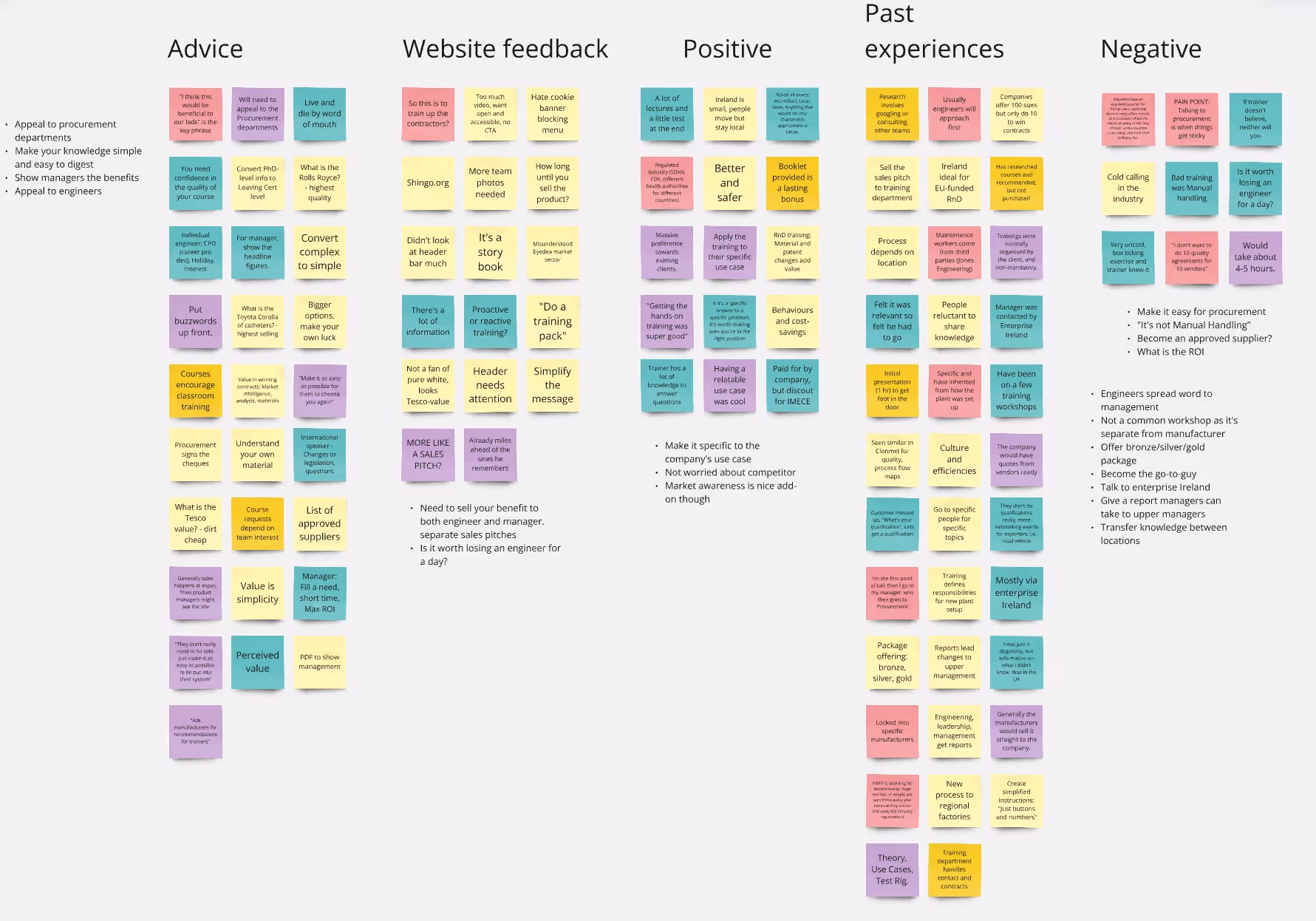
The response and data gave me a strong foundation for my design arguments that the client had not been expecting, so it really helped strengthen his trust in the UX process.
He also saw the value in the survey responses, and wanted to incorporate it into his regular workflow.
Using an empathy map after my conversations with manufacturing engineers and technical project managers, I quickly developed three clear target audience personas: Engineers, Managers and Fulfillment Department Admins.
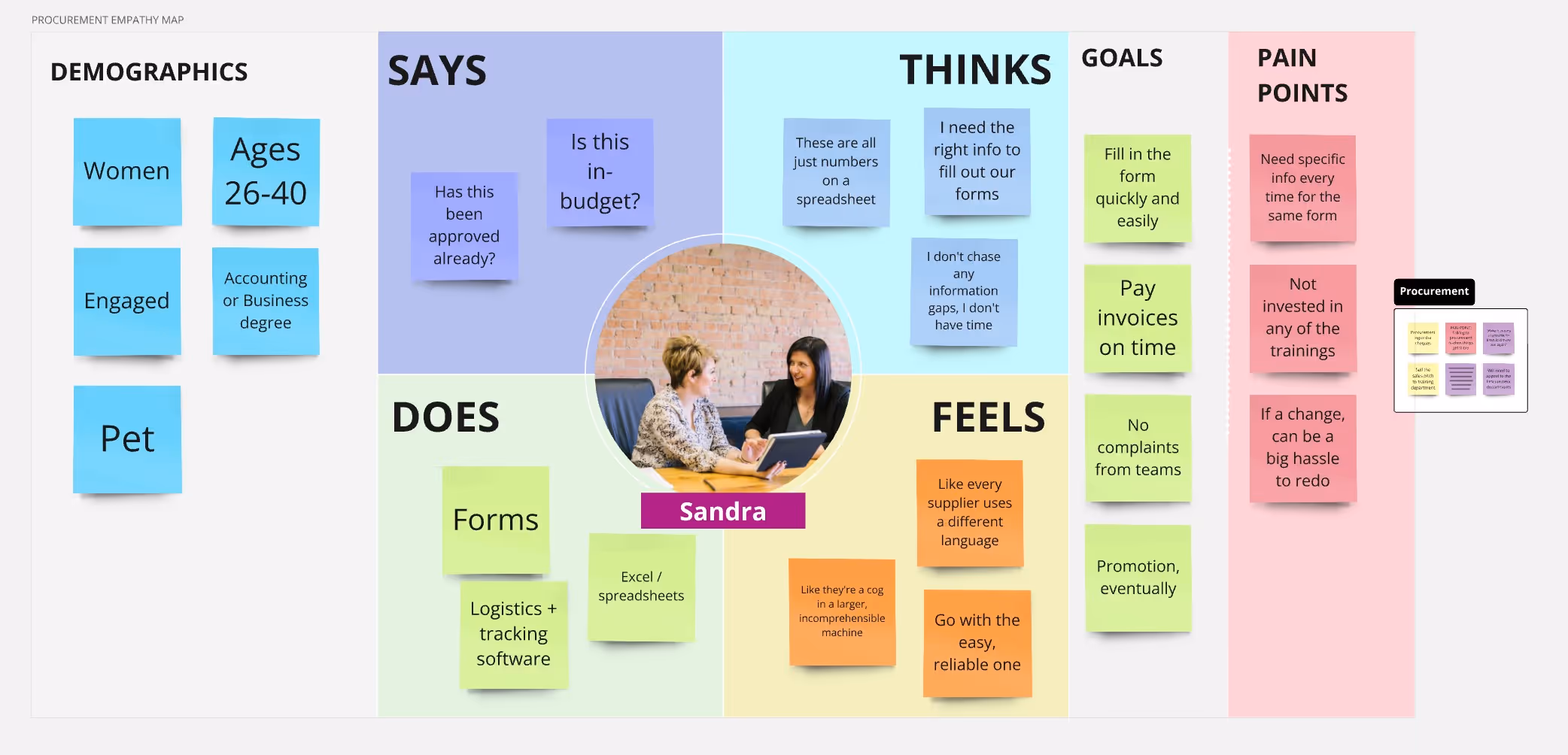
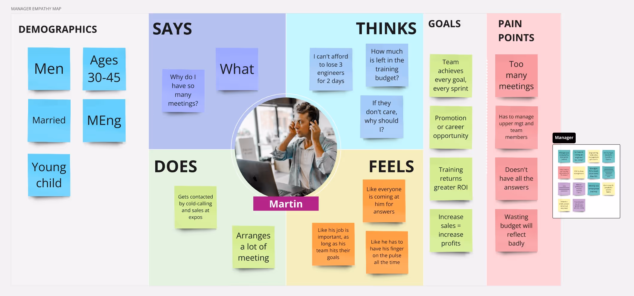
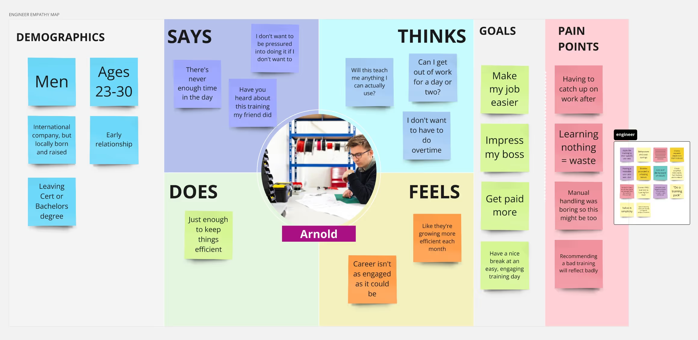
The site and business needs to appeal to both engineers and their managers to grow, but these audiences have different requirements.
Engineers prioritise immediacy (subject interest, solve problems, entertainment) while managers prioritise long-term investment (metrics, ROI, skill building).
.jpg)
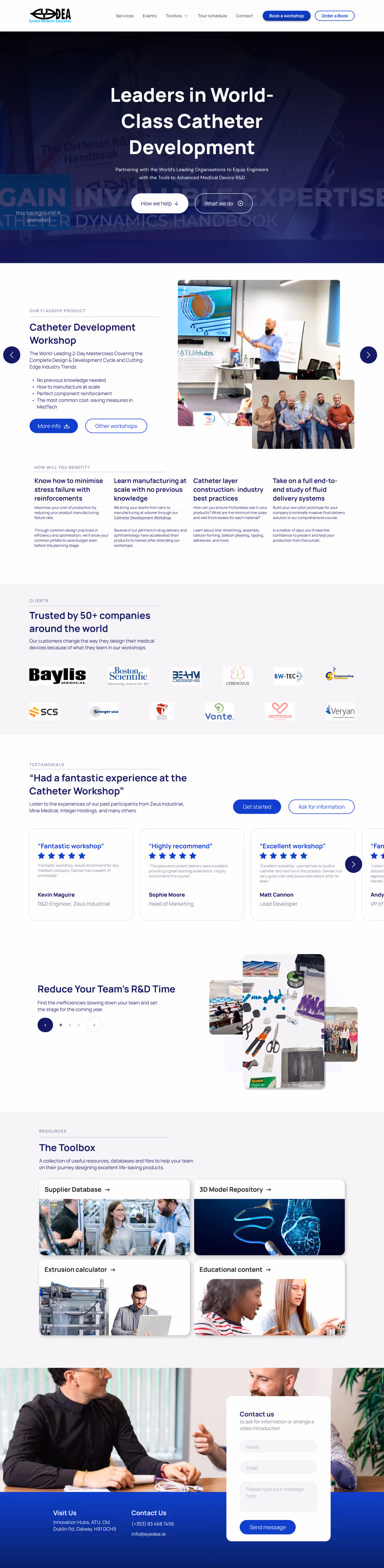
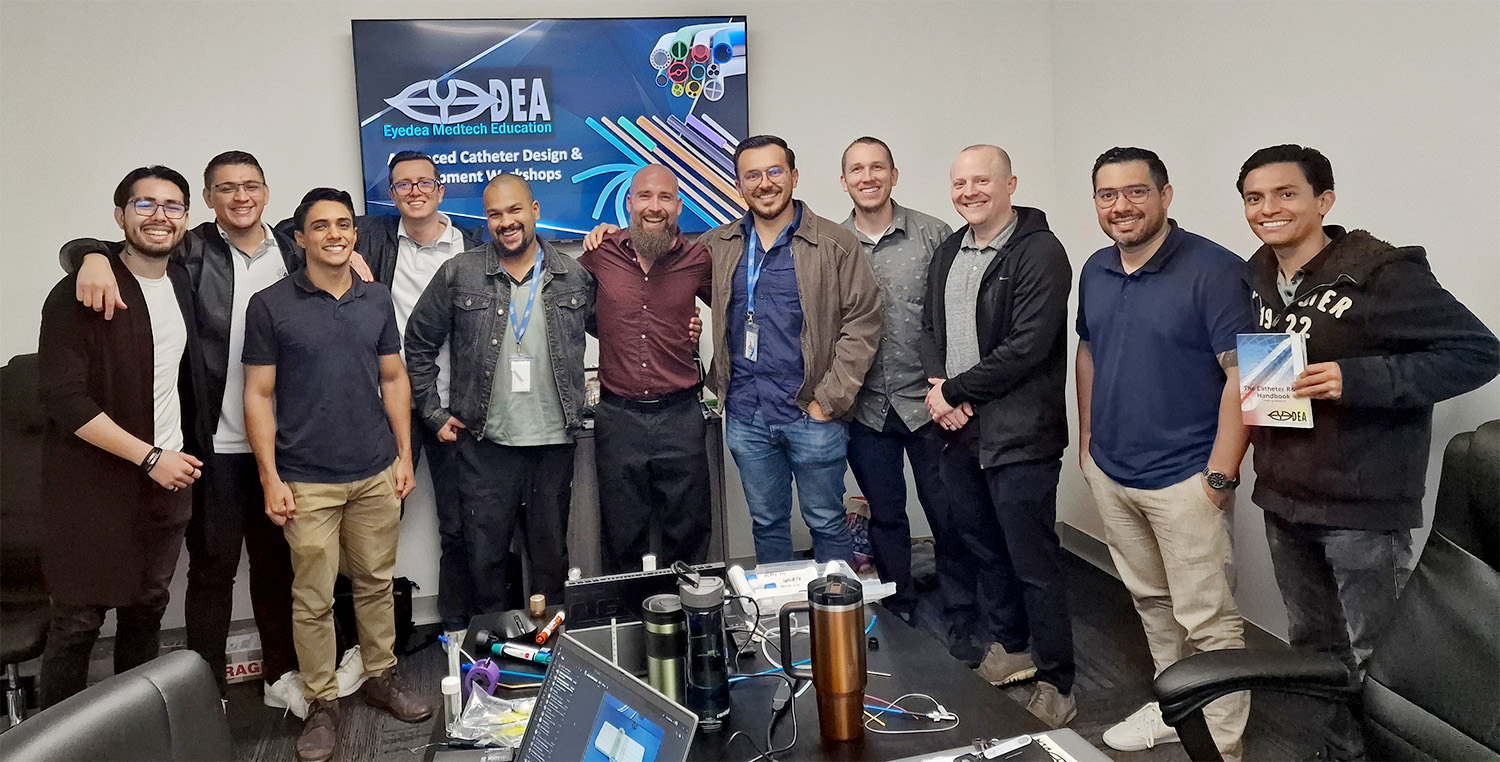
Research showed word of mouth was by far the most common way people had heard about Eyedea. Leaving the participants with something they can keep in their office ensures a constant reminder of theit positive experience with the brand.
.jpg)
Find two audience priorities, and go from there. If Engineers want to know if the workshop is enjoyable, show them with the deep library of images and testimonials. If managers want to know the business benefits, provide easy statistics and downloadable leaflets they can bring to their superiors to justify the workshop’s cost.
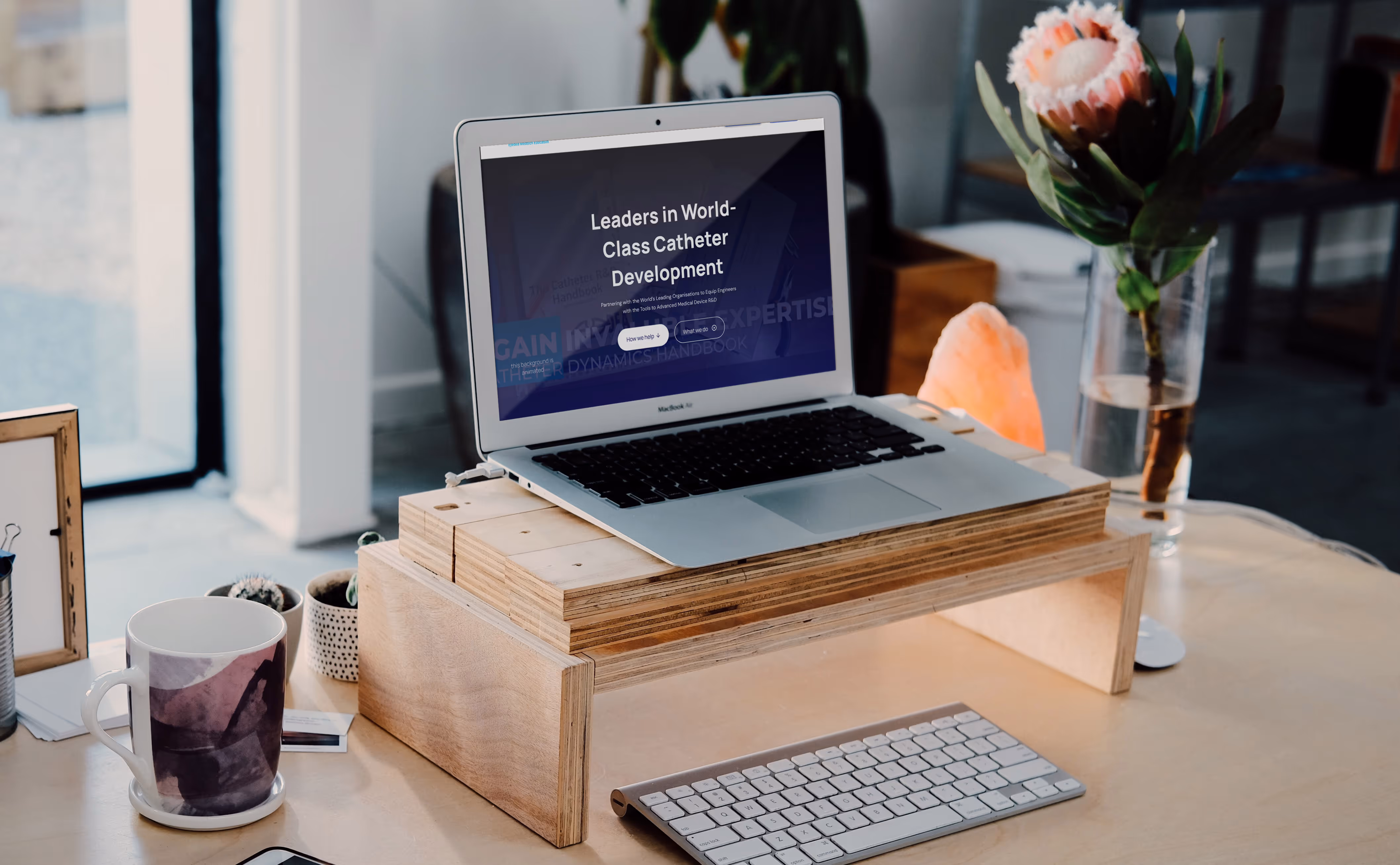
Building the new site, block by block, I wanted to arrange each fold in order of importance to our manager and engineer personas.
After our hero and value proposal, I wanted to show off their most popular workshop and testimonials to build a strong social proof and expectation.

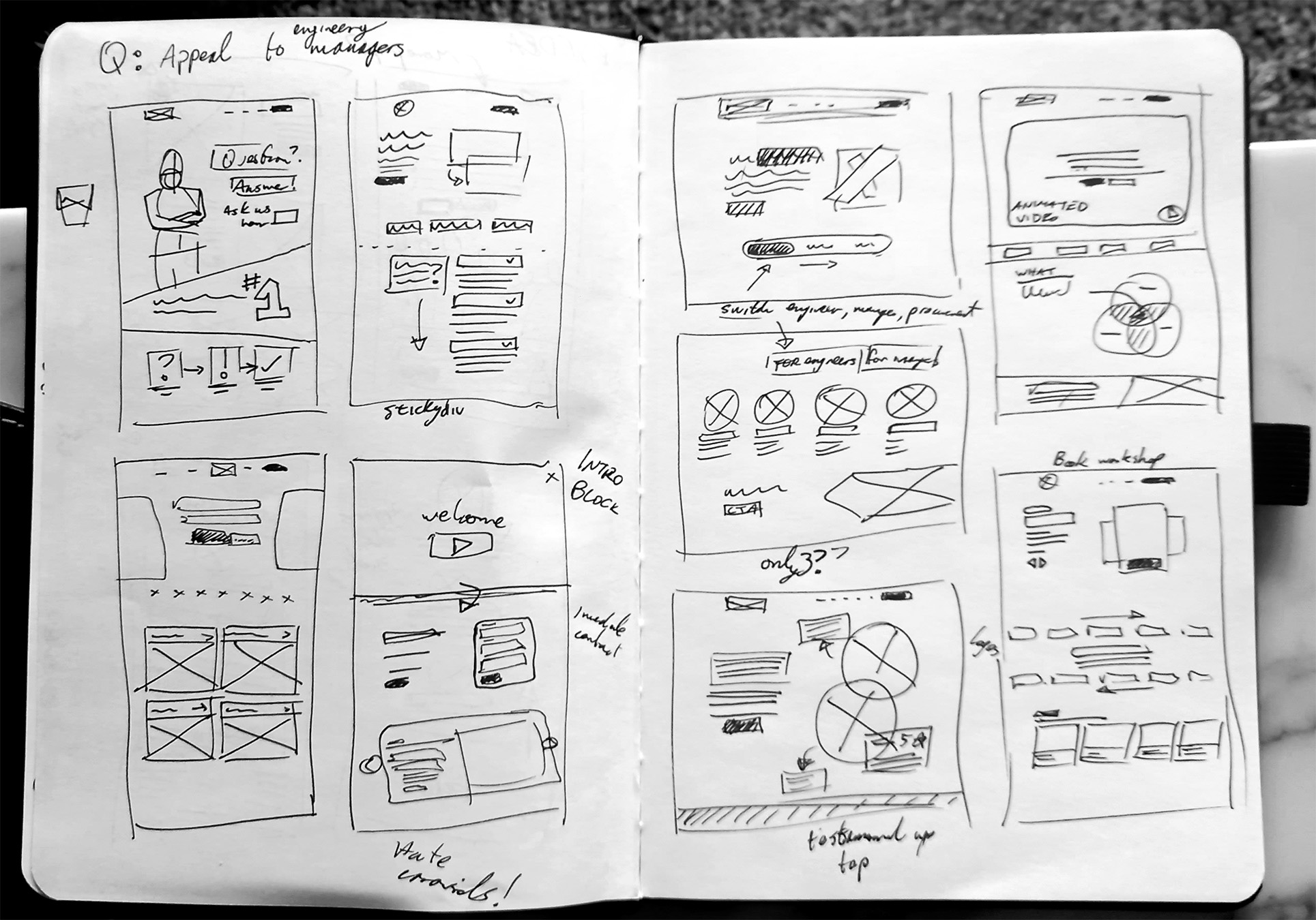
After sketching, I walked through some lo-fidelity drafts with the client to show how I understood his customer base and the new approach the homepage should take.
This also gave him an early opportunity to steer the marketing messaging of the site and build a backlog of ideas.


The first versions of the homepage went through a few iterations as the client wanted more information density and colour coordination before sending out for external feedback.
It became clear that the client had much grander expectations for the future of the platform.
To help compromise on these needs, we agreed to build the new site on the Webflow platform rather than be hamstrung within the limitations of his original specification to remain on Wordpress.

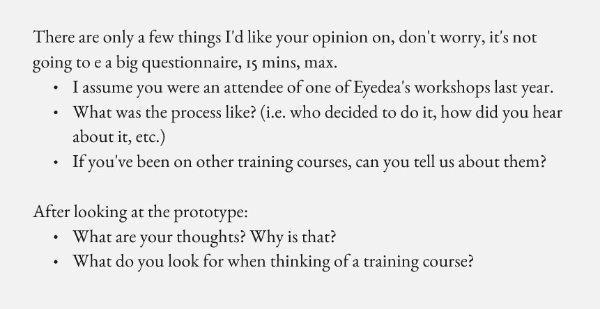
During the research phase I had built a short feedback survey and asked Eyedea to reach out to past clients to ask if they’d be available for a short interview. Thanks to this, I talked to two previous users and sent them a mid-fidelity prototype of the site, talking about their broad experience and priorities when upskilling as an engineer.

Positives:
However: