UX Qualification Project

Building the next generation of UX designers

How I used qualitative data to redefine the program offering sof the UX TREE website, improving its student acceptance rate and halving the time needed to process applications. (2024)

Winner: Best Prototype Award - UX Tree Mentorship Round 7

+19% 📣

Net Promoter Score

+92%🎓

Acceptance Rate

Winner🏆

Best Prototype - UX Tree Mentorship Round 7

The Challenge

"It feels like we keep having to answer the same questions. We'd like you to see what we can do to fix that."

UX Tree is a small, Ireland-based organisation dedicated to training industry-ready UX designers. However, processing 12-15 quality applicants out of several hundred is a major drain on resources, especially when applicants are mistaken or unsuited to the course.

As a part of my UX Tree Mentorship program, I was asked to study the UX Tree website itself and determine how to improve the application rate by researching how its current users behave and reducing any friction points.

After interviewing 30+ UX students and professionals, UX Tree implemented many of my suggestions, including layout, terminology and imagery updates, leading to higher student conversion rates and smoother student processing.

Industry:

Design Education

Location:

Dublin, IE

Priorities

User Research, System Design, User Journey Mapping, Web Design

Programs Used:

Figma, Maze, Webflow, HotJar

Framework:

Double-Diamond (Source: DesignCouncil.org.uk)

Context & Introduction

“You cannot have a "fitness trainer" website mentality. People won't just magically come here.”

UX Tree was founded in 2020, and takes in small numbers of UX students for high-quality, individualised, one-to-one online mentorships every few months with the goal of producing industry-ready graduates. Based in Dublin, Ireland, it has an extremely well-respected reputation among the city’s small community of UX designers.

After the first meeting with the founder I noted:

As UX Tree is extremely limited in the number of students it takes on with at any one time, they have diversified with secondary revenue streams, such as online video courses and corporate partnership offerings.
The business works with Design Skillnet, a government programme, to give graduates an official certification.
75% of the website’s users visit using a desktop PC, so it should be desktop-first.

Problem

Every cloud . . .

UX Tree wants to minimise friction and confusion about their business offerings to first-time users, in order to maximise the quality of applicants, resulting in industry-ready, influential graduates.

Opportunity

. . . has a silver lining.

As there’s no issue with the number of applicants, the key metric for success is reducing incorrect or misaligned applications, as each student needs to be individually interviewed and vetted.

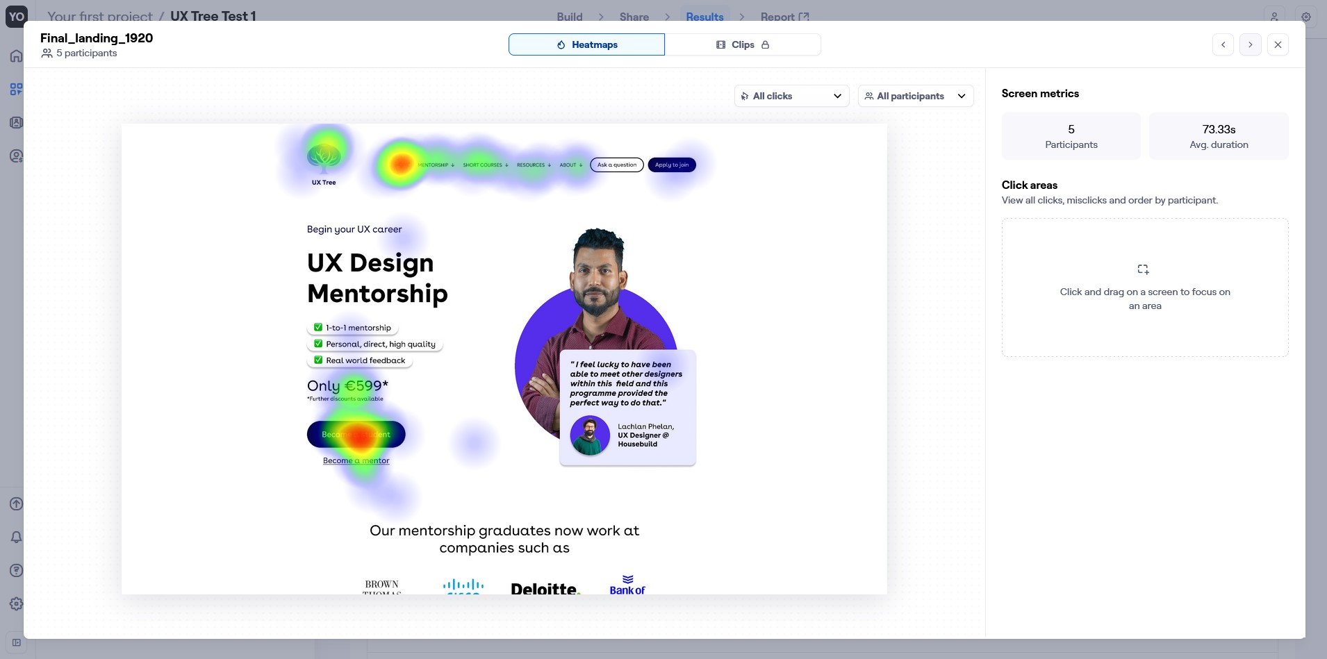
To find a solution, I wanted to examine the homepage and see what expectations it sets, backed up with data gathered from examining users and looking at it’s analytics.

Discovery

What are we trying to prove?

Is there a need to refine the overall website visitor experience and how the value proposal is explained? If so:
What do website visitors look for? How can we appeal directly to it?
What pain points currently exist and what I can do to address them?

Research results

“It suffers all the usual problems of being a side-gig.”

88% of respondents had worked with someone they considered a mentor
The site’s Net Promoter Score from UX students was 21, but for UX professionals was -37! So there was considerable room for improvement.
Users visibly responded to recognisable logos and brands in past projects, though they were placed near the bottom of the page, so weren’t being seen by 40% of visitors.

Pain Points

The CTAs present didn’t align with their expected outcomes
The imagery was vague and disconnected from the glowing testimonials
The application form was a Google Form, which “felt like a student project”

Empathy mapping

Segmenting the research results into 4 digestible groups

a miro board of hundreds of post-its
New graduates:

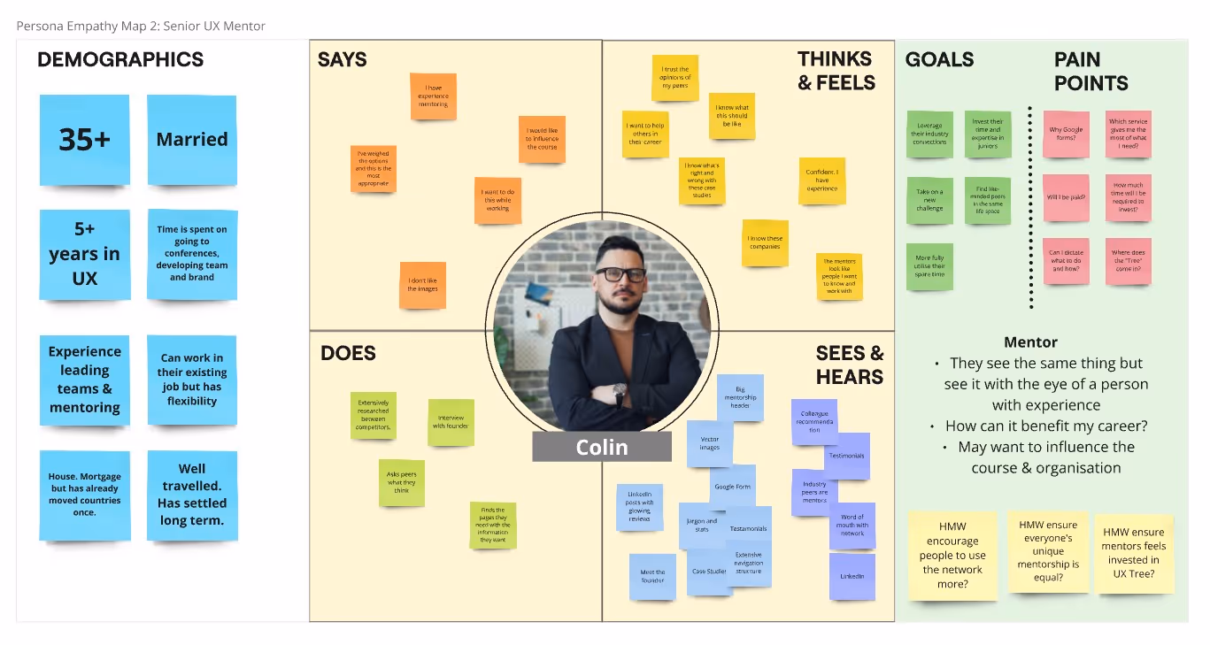
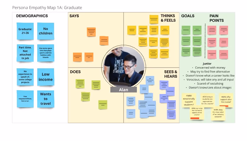
“I want to start my career in UX”

Experienced career changers:

“I want to move into UX”

Senior UX designers:

“I want to share what I’ve learned”

The UX Tree steering committee:

“I want UX Tree to require less micro-management.”

Key Findings

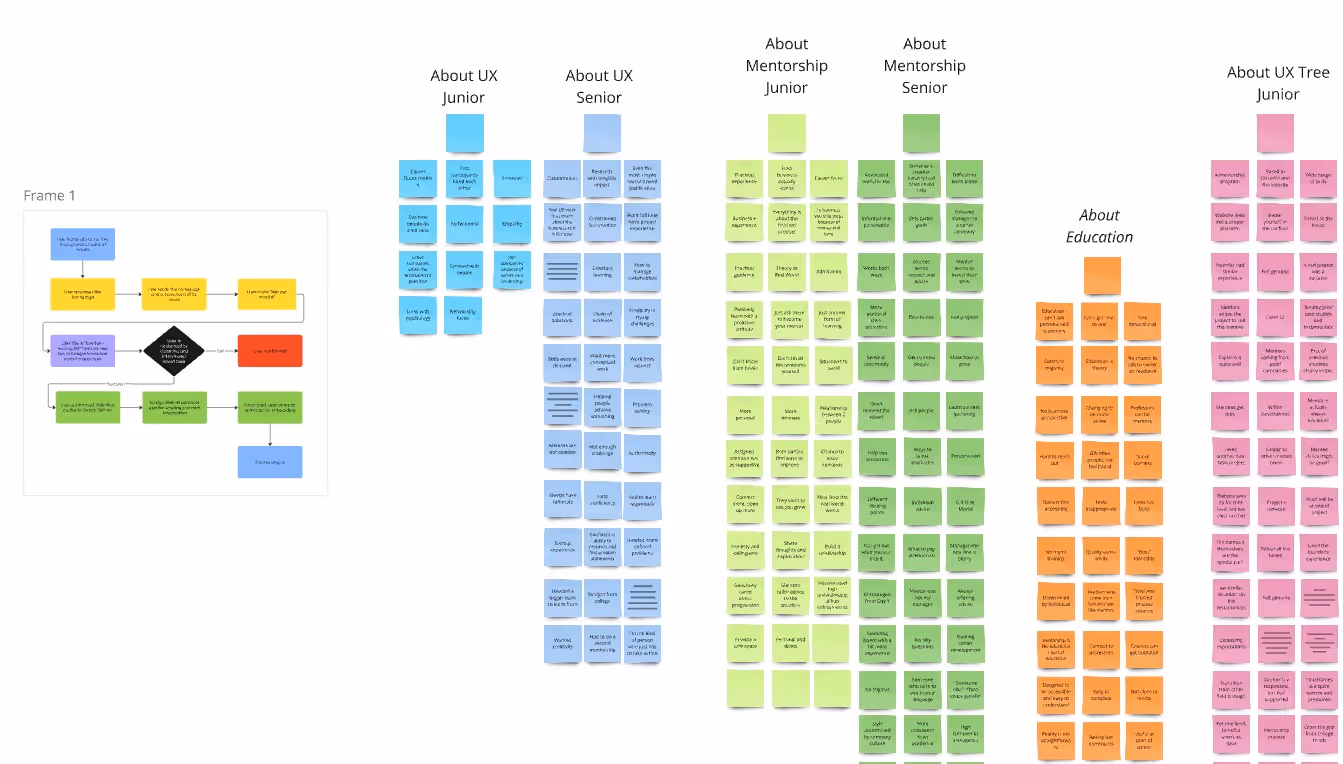
Sorting through the notes, a few key themes emerged that also aligned with the business’ priorities:

Users wanted clearer communication
Users wanted more relevant content
UX Tree should connect the course outcomes to the user’s goals
UX Tree can use stories of success to build trust

So. . .

I identified that the crossover in wants and needs centered around 3 main topics:

Mentorship

Users wanted a clear, concise explanation of what the mentorship course would entail, as if they had no previous experience

Case Studies

Users know their importance, but designers at the start of their career have no wider context to gauge the quality of their portfolio projects

Community

Senior designers know the true value of having people in the industry know your name, and the opportunities it can afford.

Problem Statement

What is the core issue I’m trying to solve?

“The website needs to communicate and deliver the values of quality mentorship, application-ready case studies, and an interactive community‍‍

in order to inspire the
right users to sign up‍‍

so that it can maintain and grow its reputation as a producer of top-tier UX talent.”

HMWs

How Might We’s

How might we clearly communicate the mentorship course?

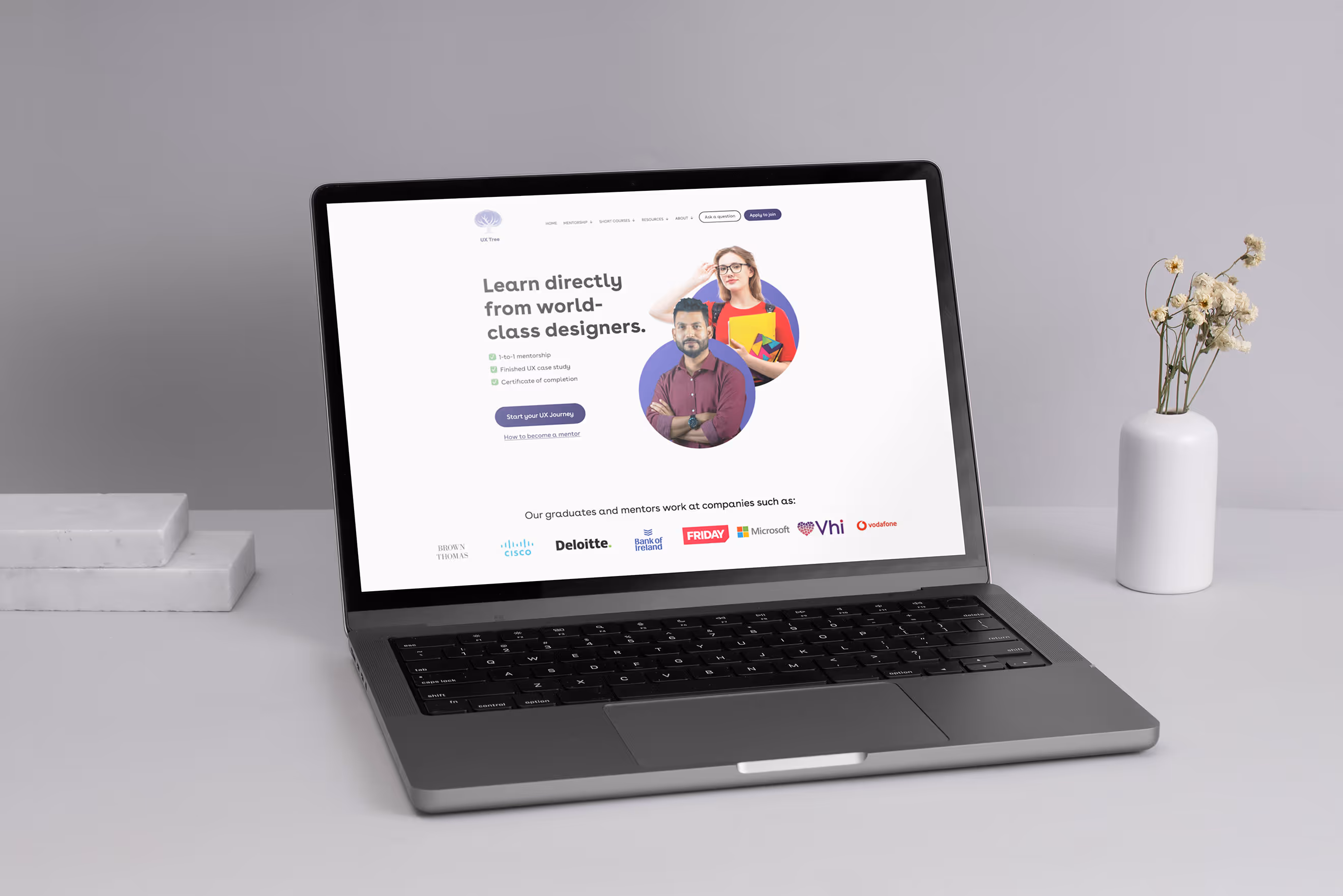
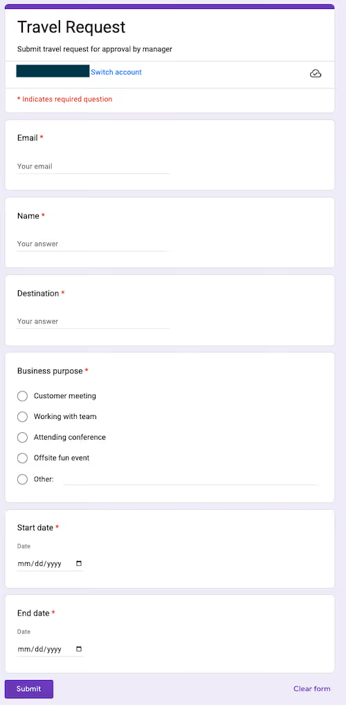
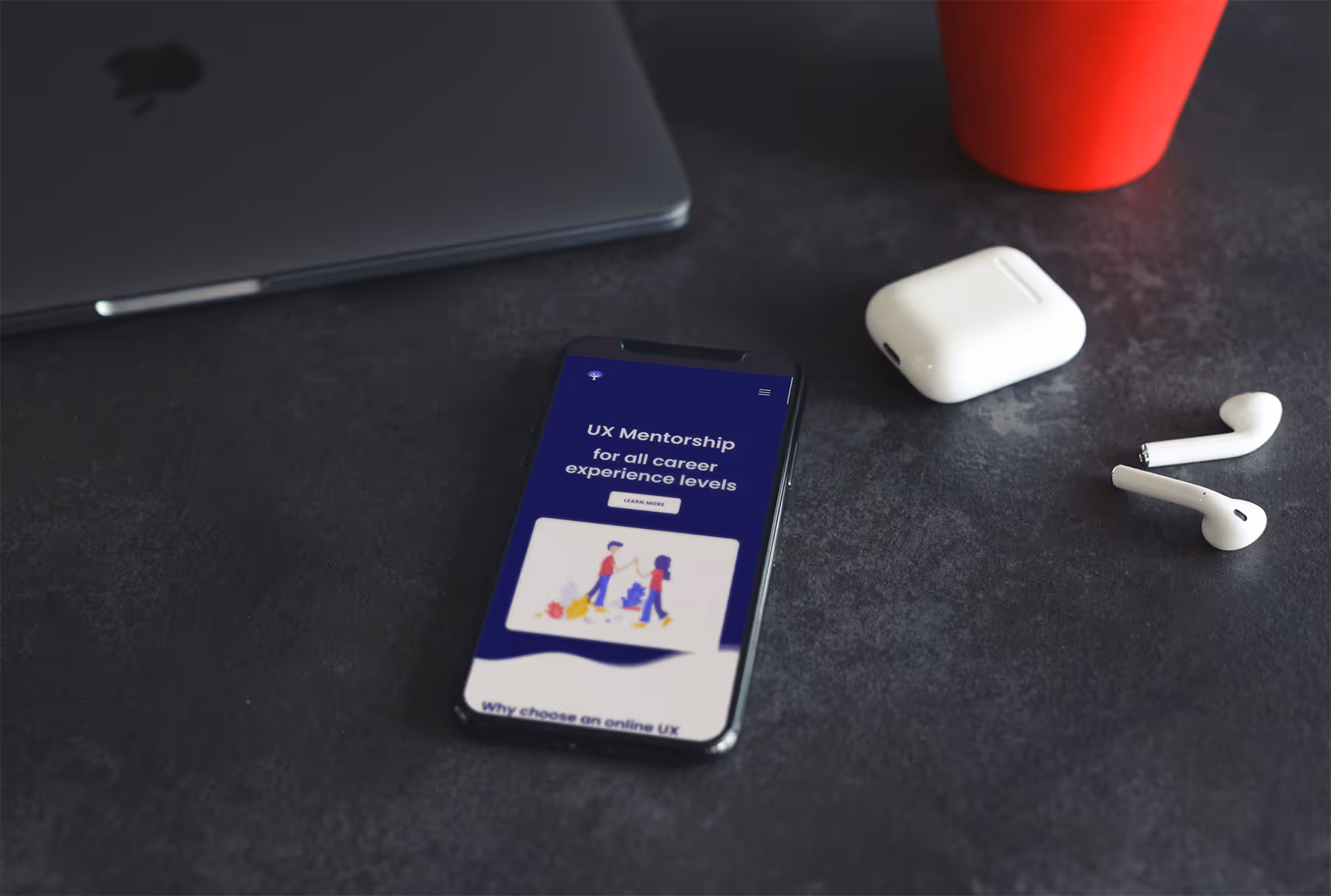
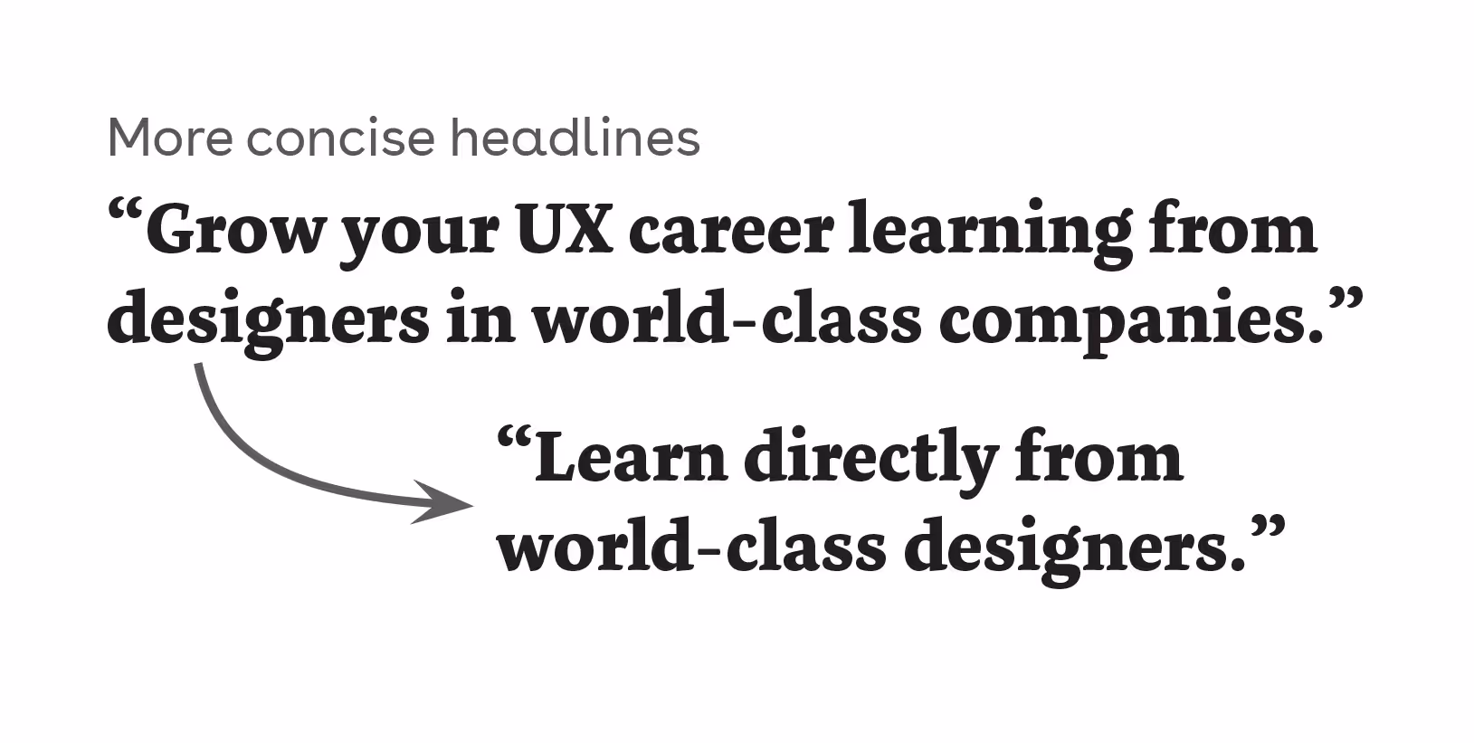
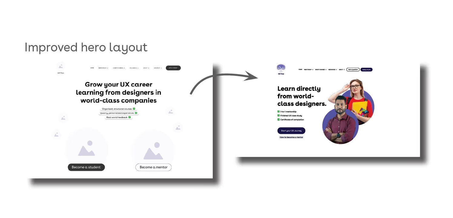
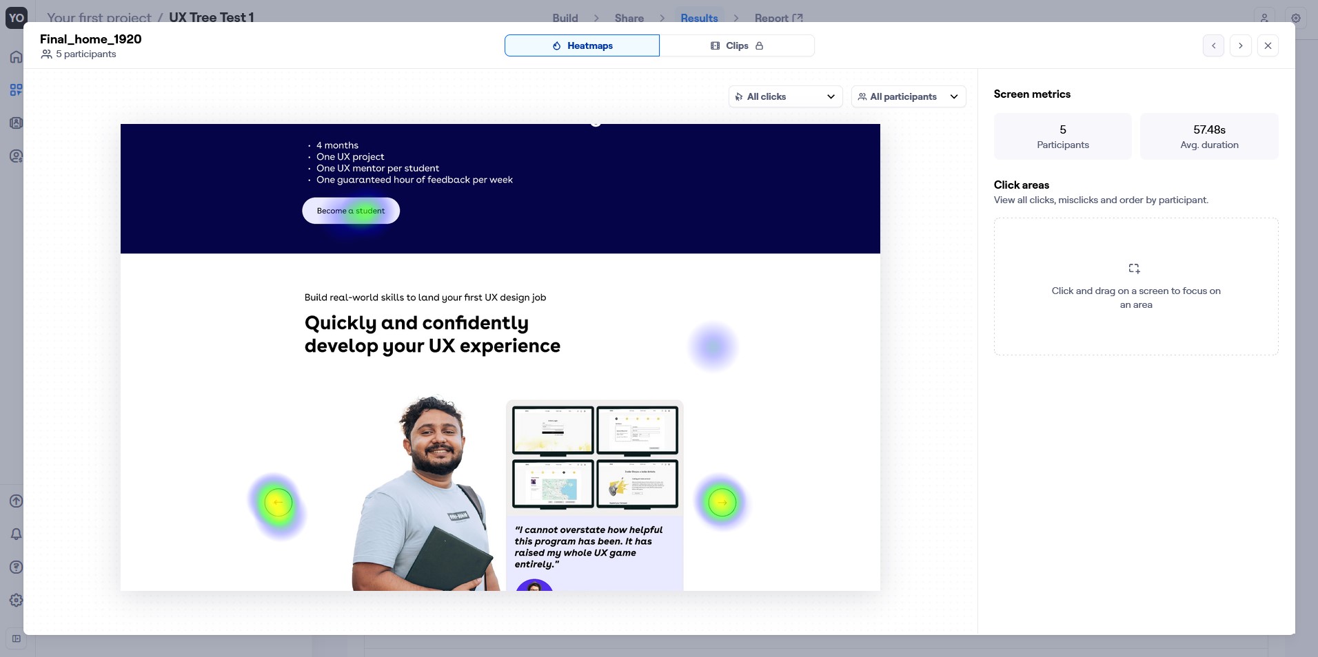
I saw first-time users find difficulty describing what the website offered, so wanted to shore up any miscommunications as soon as possible with a quick, persuasive piece of copy within the first 2 folds.

How might we demonstrate the benefits of a quality case study?

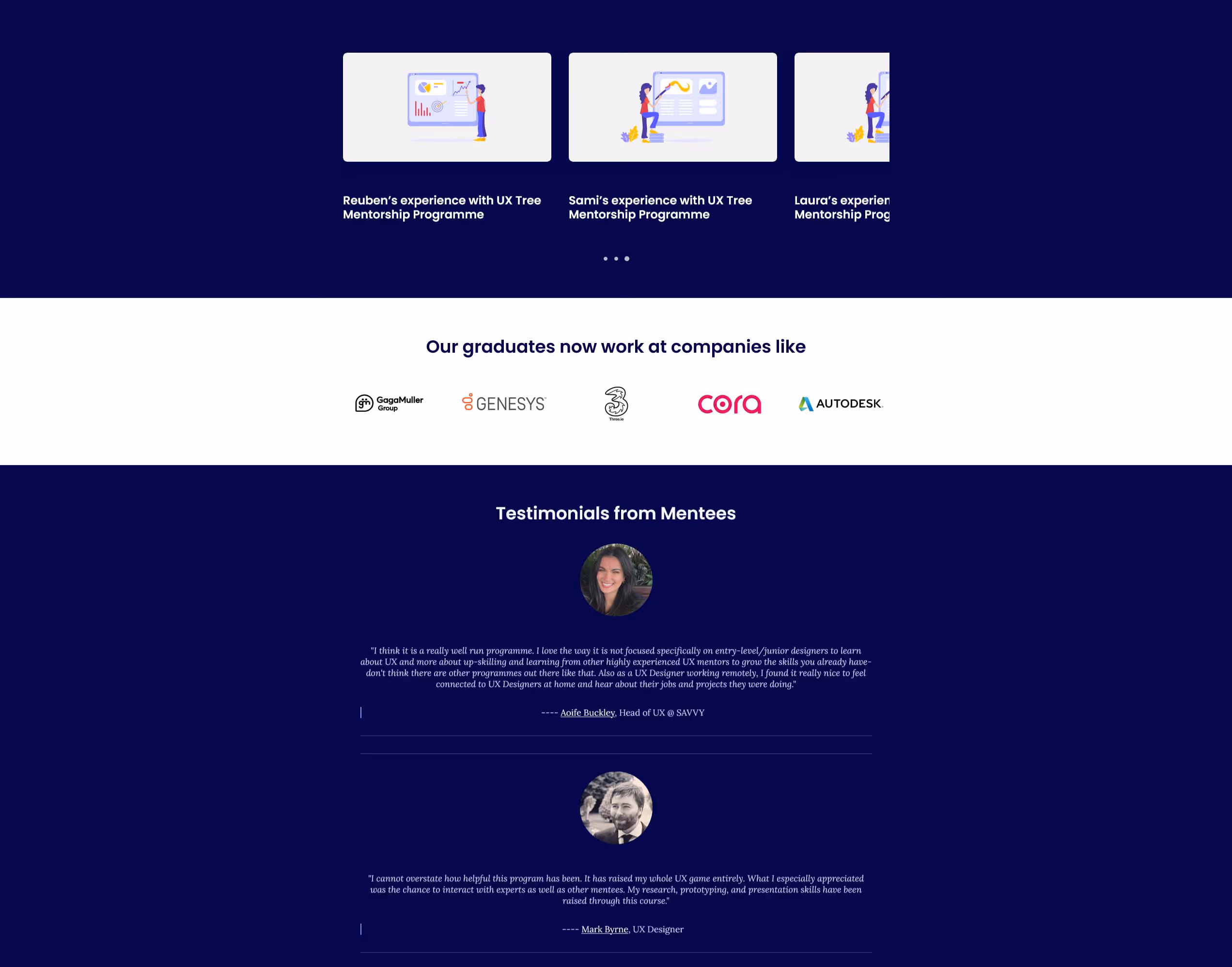
A quality case study should lead to a job. By combining a testimonial and case study from a single successful student, I hypothesised I could combine several sections into one, efficient, persuasive social proof.

How might we show how participants can benefit from UX Tree’s community?

During testing, there was a visible positive reaction to using the recognisable brands of mentors and case studies. I used this to clearly demonstrate the benefits of connecting to such a community.

Sketching

Back to basics

Disconnect from the computer screens and sketch ideas that will directly help alleviate the issues found in my research.

Prioritise social proofs like the companies, Case Study and Testimonial sections
Change to a light-mode colour scheme
Treat new mentors as a secondary user persona
Focus the UX Mentorship course as the primary Call To Action
For testing, focus on prototyping only two pages from the website; the home page and UXMentorship landing page

Wireframe testing

First impressions

3 of 3 testers asked to further simplify the messaging.
2 of 3 testers wanted increased information density where possible.
2 of 3 testers wanted clear, consistent CTAs for both hard- and soft-commitment.
1 of 3 testers expected more tangential materials, such as FAQs and pdfs.
3 of 3 testers preferred the second page heroto the home page layout.

Improvements

Take action

A clearer hero layout to build confidence and set expectations
Consistent CTAs for clear navigation and mental models
Updated imagery focusing on the successful past students
In-built webforms, as expected of a modern,professional business

Final Testing

Casting a wider net

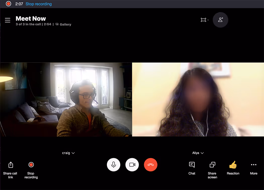
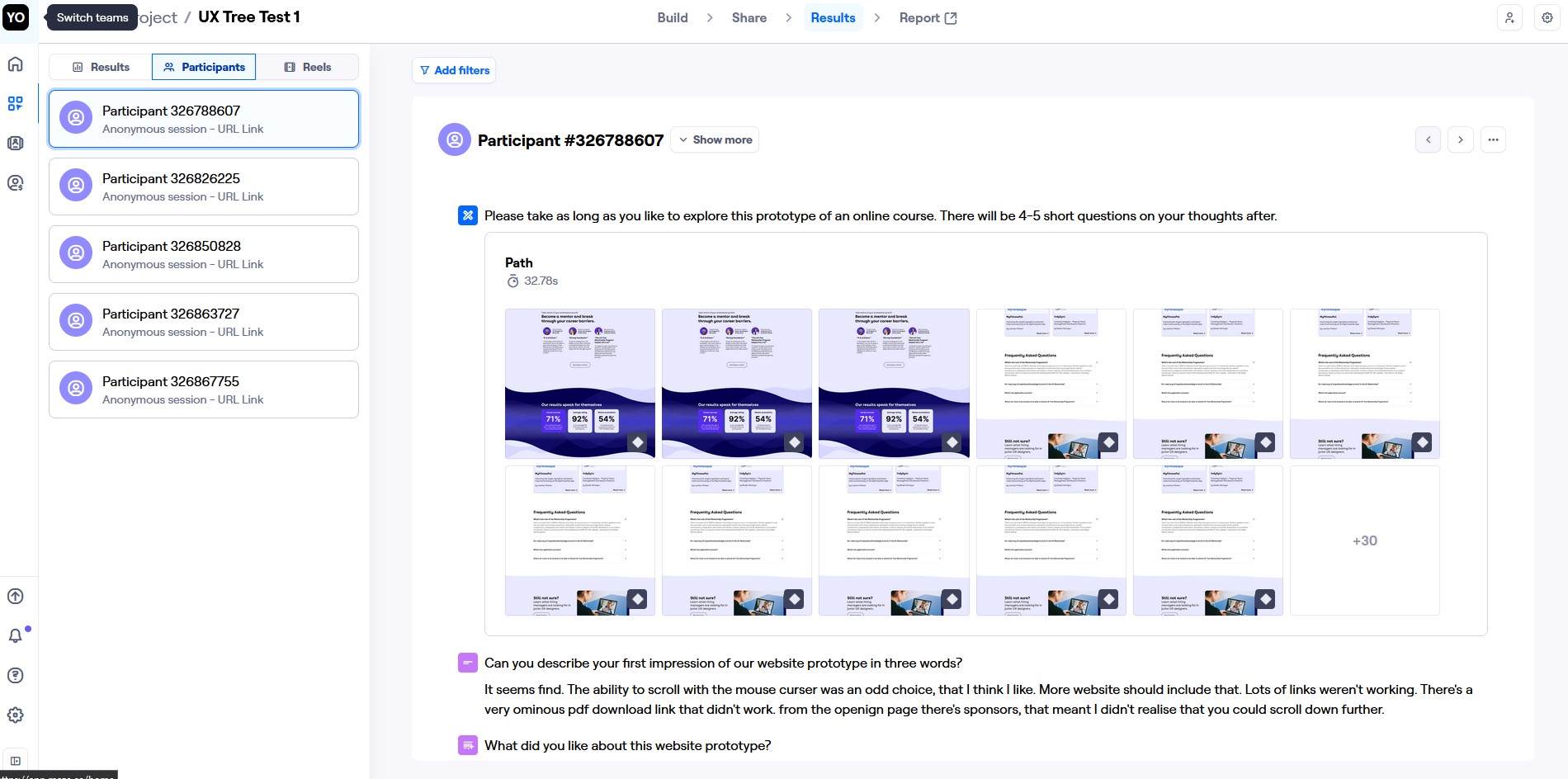
Through Maze, I sent a final few invitations for honest and open feedback, this time to non-UX professionals to gather opinions from a broader audience who wouldn’t have been as familiar with industry terminology that I might take for granted.

The new score of 25 (+19%) was a notable improvement over the initial avg. NPS of 21.
80% of testers used the word “clean” in their description.
Other terms included “uncluttered”, “clear”,“concise”, “descriptive”, and “solid”.

However, because I used an automated UX testing service, it was harder to get quality feedback. With no interviewer to ask questions, responses like “Yes” or ”No” were much more common, and so lacked usefulness without a follow-up capability.

Results

Round 7

23 applicants
9 admitted to the program  

Round 8

16 applicants
12 admitted to the program  

+92% 👩‍🎓

Acceptance Rate

Where Round 7 had a 39% acceptance rate among potential students offered a place, Round 8 had 75%, thereby nearly doubling the quality of applicants and halving the work needed at that stage by UX Tree.

I was honoured to receive the “Best Prototype” award at the graduation ceremony, as voted for by the other UX Tree students and mentors.

“We had a really, really good turnaround this year in terms of the mentees that applied for the mentorship and I think all the changes that we've done on the website have been miraculous in a way.”

Rob, UX Tree Steering Committee member

“I feel we had much better quality of applicants in this round due to the content that is more straightforward and more action-oriented.”

Valentina, UX Tree Founder

Reflections

The brief requested:

Clear communications and product expectations
Maintaining quality applications
Reduce confusion
Reduce dropoff

The finished project delivered:

Prominent showing of courses and benefits
75% acceptance rate, up from 39%
Reorganised & simplified navigation
Prioritise human connection - combined Testimonials and Case Studies into one item

Learnings

Test early, test often, and test more with casual users outside of your target audience
Ask “Why” more often in interviews. Understanding is more important than pure knowledge.
Don’t rush ahead in the process. Taking the extra time to plan your approach will reap far more benefits
Gather more quantitative data from surveys to back up your theories. Don’t be afraid to pivot if what you find is unexpected

Next Project

Building a better learner driver

Using UX methodology to improve learner driver attentiveness.
Read More ➜

Eyedea Website Redesign

Using user research to appeal directly to the industry decision-makers.
Read More ➜
Instagram link icon

Web design by Craig Tyner 2025

Cookie & Privacy Policy.